What you will find in this resource
In this resource, you will find information on how to use the Brightspace HTML editor which is the Brightspace content creation tool. You will come across the HTML editor in Brightspace when you create new pages in the content area, but also in other tools you might use on a day to day basis, such as Announcements, Assignments, Discussions and Quizzes.
This guide will introduce you to the Brightspace HTML editor and will give you information on the following topics:
- Considerations for creating accessible content using the Brightspace HTML editor
- How to create an HTML page in Brightspace
- How to present your HTML pages in the Brightspace content area
How to use this resource
How to navigate the resource:
- Use the menu on the left-hand side to jump to a particular page (1), or
- Use the arrows in the top right-hand side corner of the resource to navigate to the next page within the resource (2).
How to print the resource:
- Use the print button in the top right-hand side corner of the resource to print the resource as a PDF (3).
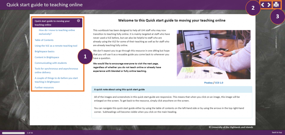 Screenshot of navigation options and print option
Accessibility considerations
The good news is that there are a number of easy things you can do when you design content using the Brightspace HTML editor to make your content accessible.
Below is a brief overview of some of the considerations you should keep in mind when you design learning materials with the Brightspace HTML editor. For a more detailed list, refer to the guide on Accessibility in digital content.
Text
1. Structure your text
- Include headings to break your text into more manageable chunks and provide a clear structure for the reader.
- Where you can, include lists in your learning materials to break down content into more manageable chunks which are easier to process.
- Text in your learning materials should be left-aligned.
2. Font size, type and colour
- Choose an appropriate font size and font type to help students with physical and cognitive impairments. The minimum font size should be 12 and your font types should be non-serif, i.e. Arial, Calibri, etc.
- Wherever possible, avoid underlining text and italics. Underlined content might look like a link and text in italics is harder to read for students with physical and cognitive impairments.
- Ensure that there is sufficient contrast between the font and the background colour. Don't use colour alone to convey meaning.
3. Hyperlinks
- When providing hyperlinks, avoid linking to text that says 'Click here'. Instead integrate links into the flow of the text, for instance: If you would like to access more useful Brightspace guidance, visit our Brightspace guidance portal.
- If you want students to be able to access hyperlinks when they print content, include the hyperlink in brackets: If you would like to access more useful Brightspace guidance, visit our Brightspace guidance portal (https://showcase.uhi.ac.uk/brightspace-support-portal/).
4. Tables
- When using tables, keep them as simple as possible.
- Include table numbers and captions.
Images, figures, charts and diagrammes
- Provide Alt text for any images you include. Alt text is a phrase / description which explains what the image shows. Alt text is particularly useful to students with vision impairment who use screen reader software.
- Include captions and numbers for images, figures and diagrammes.
- Provide a content summary for charts and diagrammes.
Videos
- Wherever possible include transcripts and captions with any of your videos.
Getting started
On the following pages, you will find step by step instructions of how you can create an interactive and accessible page in Brightspace.
We are working on a page about the Quokka, an Australian macropod.
Some of the steps are not mandatory, and maybe better suited for advanced users. You will see an indication of which steps are optional or advanced on the individual pages for each step but you will also find lists of highly recommended / encouraged, optional and advanced steps below.
Highly recommended and encouraged
To ensure that the content you create using the Brightspace HTML editor is accessible, we highly recommend and encourage you to include:
- Headings (Step 2)
- Lists (Step 3)
In addition, you should follow some of the other recommendations listed on the Accessibility considerations page above.
Optional
The following steps are optional but can help to make your content created with the Brightspace HTML editor more engaging and more accessible:
- Images (Step 4)
- Videos (Step 5)
- Tables (Step 6)
- Colour (Step 7)
- Hyperlinks (Step 8)
In addition, you should follow some of the other recommendations listed on the Accessibility considerations page above.
Advanced
The following option in the HTML editor is advanced and optional but can help to make your content created with the Brightspace HTML editor more engaging and accessible:
- Themes / Templates
More information can be found in the section on Adding a theme / template below.
When using a template, you should follow all the accessibility recommendations listed on the Accessibility considerations page above.
Step 1 - Create a File
Navigate to the content folder (Brightspace language: Module) you want to add content to.
Locate the blue Upload/Create button and select Create a File from the drop-down menu (Figure 1).
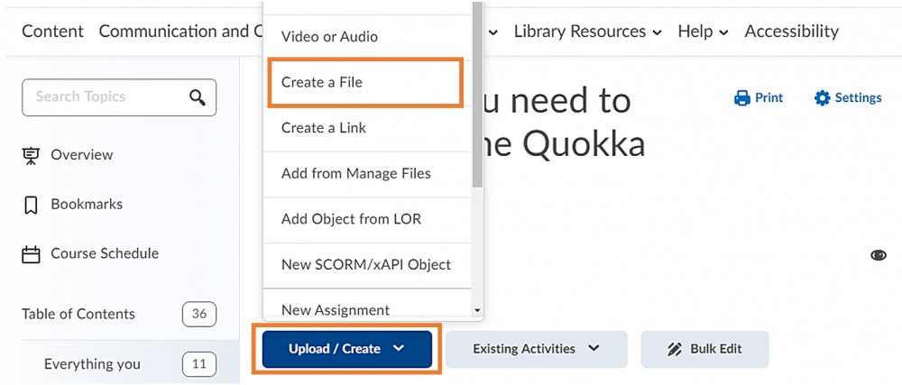
Figure 1: Brightspace content folder with Upload/Create button and the option to Create a File
This will open the Brightspace HTML editor. You can now begin to add text and create your content. You can do so either by typing directly into the text box, or by copying content from a text file and pasting it into the text box.
Opposite in Figure 2, you can see the text editing and formatting features available to you in the Brightspace HTML editor.
Insert Stuff button allows you to insert a variety of elements including video notes, YouTube videos and videos via embed codes.
This button is useful if you want to add ClickView videos or videos stored in the UHI streaming server. For more information, refer to our Quick Start Guide to Medial and ClickView.
The Insert Image button allows you to insert an image by uploading it from your computer or by using a URL.
The Insert Links button allows you to insert a link to internal content or activities or external content.
Font and Formatting features similar to MS Word etc. allows you to format your content, including bolding, tabs, lists and numbering, font type, size and colour.
Additional elements you can add are tables and equations. Next to these, you will also find options to redo, cut as well as copy and paste.
In the bottom right hand corner you will find features to check spelling and accessibility, preview and view full screen.
(Reference for Figure 2 and the description of features: downloadable D2L HTML Editor Quick Reference guide)
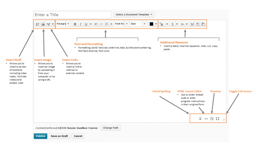
Figure 2: Overview of the Brightspace HTML features
Tips and Tricks before you continue
Tip #1 - Editing HTML pages is easier in full-screen mode

It is often easier to work on a page when you are in full screen mode. To open a page in full screen mode while you are editing, click on the four arrows in the bottom right-hand side corner of the HTML editor. Click on the same symbol again if you want to exit full screen mode.

Tip #2 - Check whether your page is accessible using the built-in accessibility checker

You can get information whether your page is accessible or not while you work on it. Simply click on the accessibility button in the bottom right-hand side corner of the screen. A pop-up window will open and will let you know about potential accessibility issues.
Tip #3 - Check whether you spelling is correct using the built-in spell checker

You can also get information about spelling issues on your page. Simply click on the check spelling button in the bottom right-hand side corner of the screen. A pop-up window will open and will let you know about potential spelling mistake. In this window, you will also be able to change the language, i.e. if Brightspace is set to English (US), you can change the setting to English (UK).

Tip #4 - Try out templates to experiment with different ways of formatting your content

When you work in the HTML editor, you can either work top down in the text box formatting your own content as you go, or you can use one of the built-in Brightspace templates. More information on how to do this can be found in the section Adding a theme / template below.
More information can be found in the section on Adding a theme / template below.
Step 2 - Adding Headings
Headings help to break your text into more manageable chunks and provide a clear structure for the reader.
After you have added content to the text box of the HTML editor, either by typing directly into the text box or by copy / pasting from another source, your text will look something like what you can see in Figure 3.
You can now start editing this text, for instance by adding headings to the text.
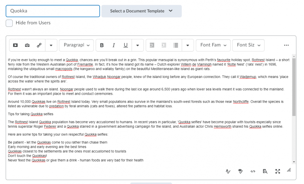 Figure 3: Basic text in the text box of the HTML editor
To add a heading, highlight the text you would like to make a heading and select a heading type from the Format drop-down menu (Figure 4).
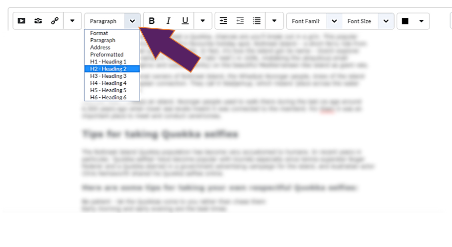 Figure 4: Format drop-down menu in the menu bar of the HTML editor
You will now see that your (sub)heading(s) has been added to the text (Figure 5).
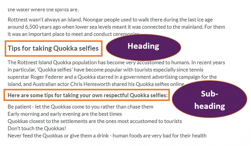 Figure 5: Text with heading and subheading
Have a look at the video opposite to see what the text looks like once headings have been added to it.
Click on the broken-up rectangle in the bottom right-hand side corner to see the video full screen (Figure 6). To exit full-screen mode, press the ESC key on your keyboard.
 Figure 6: Video menu with option to toggle to full screen
Step 3 - Adding lists
Lists in your learning materials also help to break down content into more manageable chunks which are easier to process.
Next, consider turning some of your text into a list. Click on the list button in the menu bar of the HTML editor (Figure 7).
This will allow you to add a list with bullet points (Brightspace language: Unordered List). To get a list with numbers, click on the drop-down menu next to the list button and select Ordered List (Figure 8).
 Figure 8: Ordered list option in the drop-down menu next to Unordered List button in the menu bar of the HTML editor
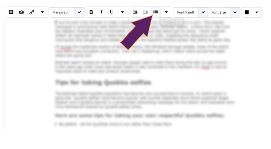 Figure 7: List button in the menu bar of the HTML editor
You will now see that your list has been added to the text (Figure 9).
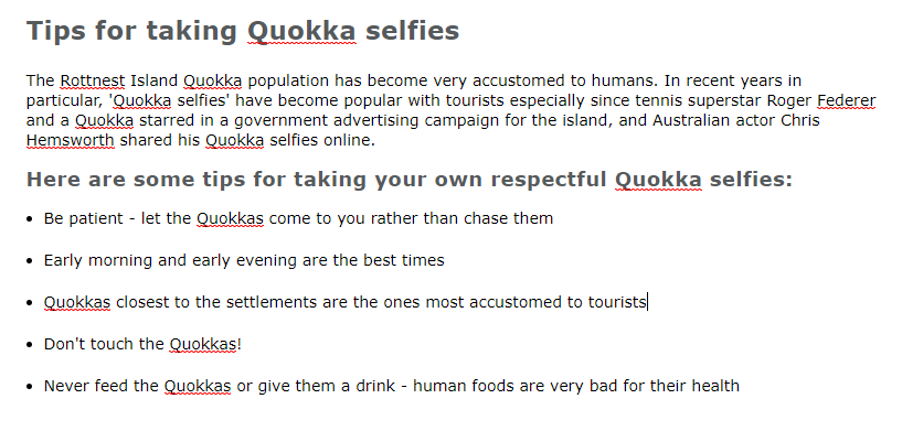 Figure 9: Text with list
Have a look at the video opposite to see what our text looks like once headings have been added to it.
Click on the broken-up rectangle in the bottom right-hand side corner to see the video full screen (Figure 10). To exit full-screen mode, press the ESC key on your keyboard.
 Figure 10: Video menu with option to toggle to full screen
Step 4 - Adding images (optional)
Images can help make your page more interesting.
When using images remember:
- Provide Alt text for any images you include. Alt text is a phrase / description which explains what the image shows. Alt text is particularly useful to students with vision impairment who use screen reader software.
- Include captions and numbers for images.
You could now add some images to your page. To do so, click on the Insert Image button in the menu bar of the HTML editor (Figure 11).
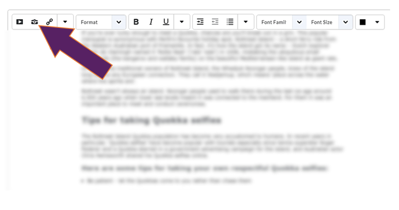 Figure 11: Insert image button in the menu bar of the HTML editor
As part of the upload process of your image you will be asked to provide Alternative Text / Alt text (Figure 12).
Just as a reminder: Alt text is a phrase / description which explains what the image shows. Alt text is particularly useful to students with vision impairment who use screen reader software.
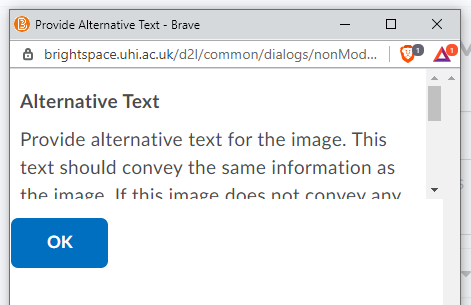 Figure 12: Alternative Text pop-up window
Scroll down within the Alt text pop-up window and enter a description of the image (Figure 13). When you are done, click OK and continue with the upload process of the image.
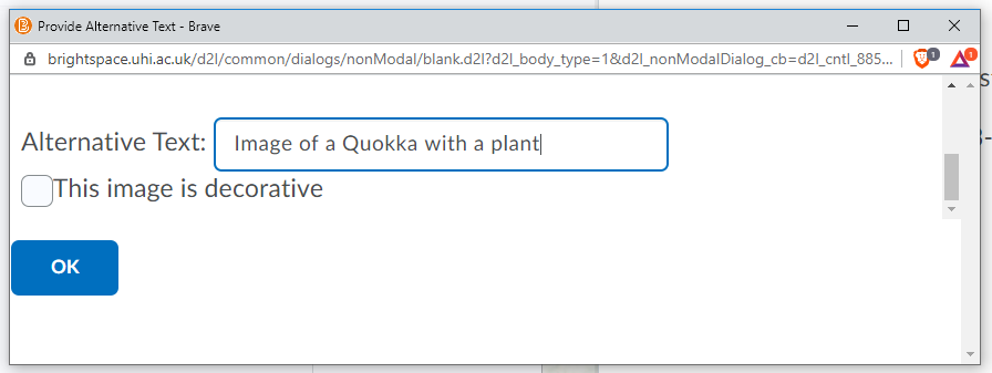 Figure 13: Alternative Text pop-up window
You will now see that your image has been added to the text (Figure 14).
It is easiest to insert images that sit above or below a paragraph of text. In the video below you will also see an image that is floating next to a paragraph of text but inserting an image this way is a bit more complicated.
The easiest way to do this would be by using a template. For more information on templates, check out the respective section on Adding a theme / template (Advanced) below.
 Figure 14: Text with image
Have a look at the video opposite to see what our text looks like once an image has been added to it.
Click on the broken-up rectangle in the bottom right-hand side corner to see the video full screen (Figure 15). To exit full-screen mode, press the ESC key on your keyboard.
 Figure 15: Video menu with option to toggle to full screen
Step 5 - Adding videos (optional)
Videos can help make your page more interesting and might be a nice addition for certain types of learners.
When using videos remember:
- Wherever possible include transcripts and captions with any of your videos.
You could now also add some videos to your page. To do so, click on the Add stuff button in the menu bar of the HTML editor (Figure 16).
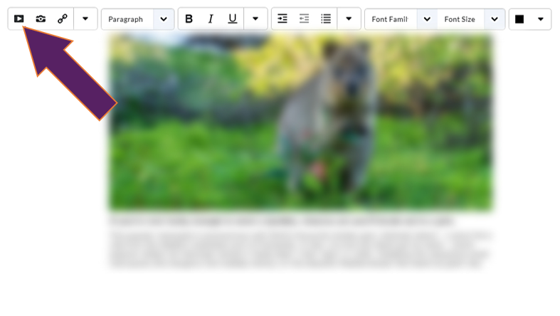 Figure 16: Add stuff button in the menu bar of the HTML editor
A pop-up window will open (Figure 17). You will now be able to select what type of video, i.e. Video Note or YouTube, you want to insert and how you want to insert it, i.e. from YouTube / Medial / ClickView or via an embed link.
If you want to learn more about adding ClickView videos or videos stored in the UHI streaming server, please refer to our Quick Start Guide to Medial and ClickView.
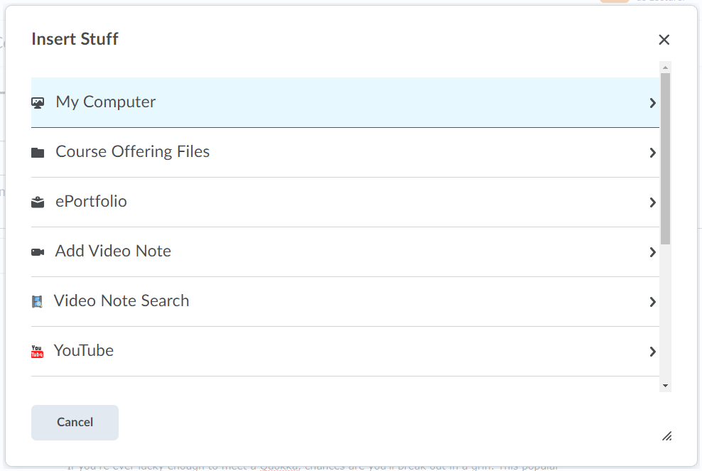 Figure 17: Insert stuff pop-up window
You will now see that your video has been added to the text (Figure 18).
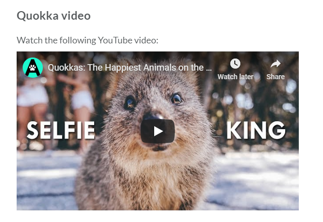 Figure 18: Text with video
Have a look at the video opposite to see what our text looks like once a video has been added to it.
Click on the broken-up rectangle in the bottom right-hand side corner to see the video full screen (Figure 19). To exit full-screen mode, press the ESC key on your keyboard.
 Figure 19: Video menu with option to toggle to full screen
Step 6 - Adding tables (option)
Tables can help break learning into more bite-size chunks but they need to be simple to work with screen readers your students might be using.
You could also add some tables to your page. To do so, click on the Add table button in the menu bar of the HTML editor (Figure 20).
You can now customise the number of columns and rows you would like to add to your page.
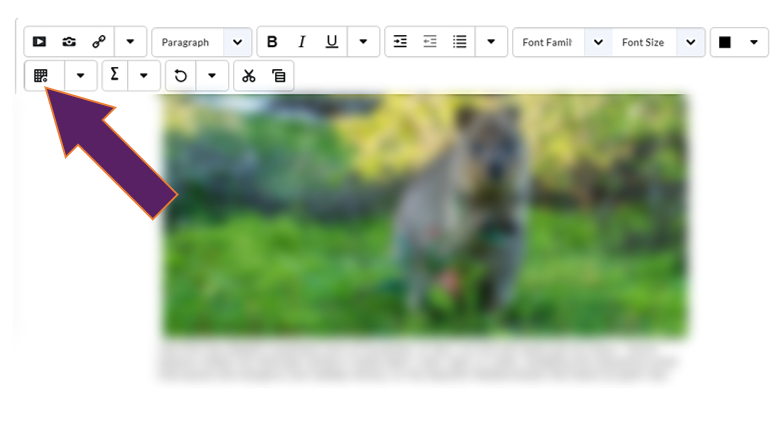 Figure 20: Add table button in the menu bar of the HTML editor
If you need to edit the table, click on the drop-down menu next to the Add table button in the menu bar of the HTML editor, and select the edit option that suits your needs (Figure 21).
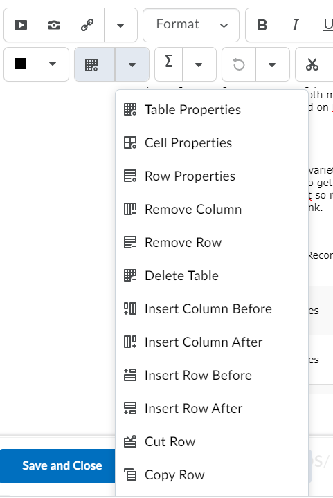 Figure 21: Edit table drop-down menu in the menu bar of the HTML editor
You will now see that your table has been added to the text (Figure 22).
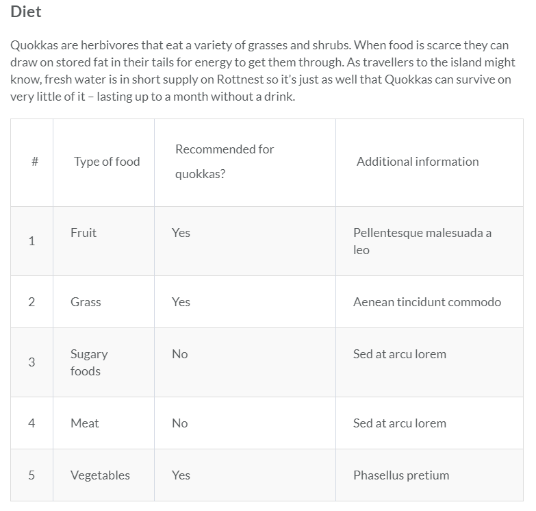 Figure 22: Text with table
Have a look at the video opposite to see what our text looks like once a table has been added to it.
Click on the broken-up rectangle in the bottom right-hand side corner to see the video full screen (Figure 23). To exit full-screen mode, press the ESC key on your keyboard.
 Figure 23: Video menu with option to toggle to full screen
Step 7 - Adding colour (optional)
Using colour can help to highlight important information or headlines but you must ensure that there is sufficient contrast between the font and the background colour. In addition, don't use colour alone to convey meaning.
You could also add some colour to your page.
To do so, select some text you would like to change the colour for and click on the Select colour drop-down menu in the menu bar of the HTML editor (Figure 24). Choose your colour and apply it to the text.
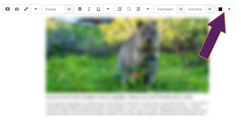 Figure 24: Select colour drop-down menu in the menu bar of the HTML editor
You will now see that the colour of the text you selected has been changed (Figure 25).
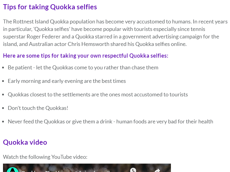 Figure 25: Text with coloured headings
Have a look at the video opposite to see what our text with some coloured text looks like.
Click on the broken-up rectangle in the bottom right-hand side corner to see the video full screen (Figure 26). To exit full-screen mode, press the ESC key on your keyboard.
 Figure 26: Video menu with option to toggle to full screen
Step 8 - Adding hyperlinks / Quicklinks (optional)
Hyperlinks are a great way to signpost Brightspace activities as well as websites and other external learning materials / resources to students.
When using hyperlinks remember:
- When providing hyperlinks, avoid linking to text that says 'Click here'. Instead integrate links into the flow of the text, for instance: If you would like to access more useful Brightspace guidance, visit our Brightspace guidance portal.
- If you want students to be able to access hyperlinks when they print content, include the hyperlink in brackets: If you would like to access more useful Brightspace guidance, visit our Brightspace guidance portal (https://showcase.uhi.ac.uk/brightspace-support-portal/).
You could signpost Brightspace activities as well as websites and external learning materials / resources to students by adding a hyperlink to your text.
To do so, select some text you would like to change the colour for and click on the Insert Quicklink button in the menu bar of the HTML editor (Figure 27).
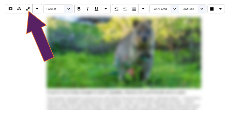 Figure 27: Insert Quicklink button in the menu bar of the HTML editor
Once you have clicked on the Insert Quicklink button, a pop-up window will open. Select the type of link you would like to add (Figure 28).
Quicklinks can be links to activities and other items created in Brightspace. You can also link to an external page by scrolling down the Insert Quicklink options list to 'URL'.
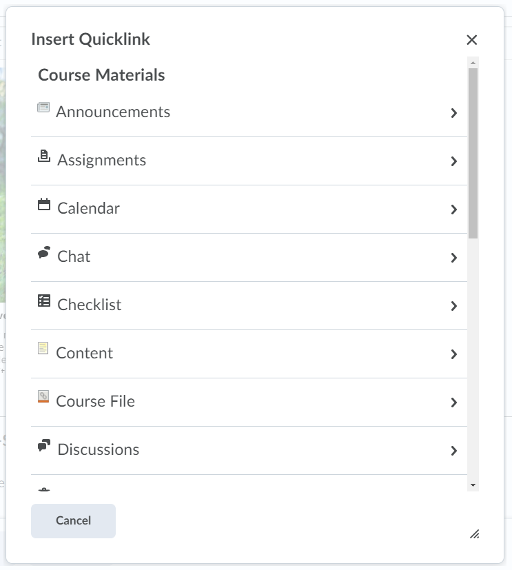 Figure 28: Insert Quicklink pop-up window
You will now see that the Quicklink you selected / hyperlink you created (Figure 29).
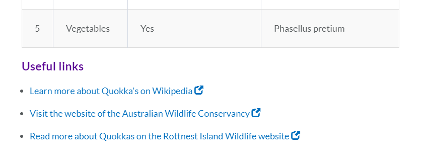 Figure 29: Text with hyperlinks
Have a look at the video opposite to see what our text with some coloured text looks like.
Click on the broken-up rectangle in the bottom right-hand side corner to see the video full screen (Figure 26). To exit full-screen mode, press the ESC key on your keyboard.
 Figure 30: Video menu with option to toggle to full screen
Before and after
Below, you will see what our page looked like before we went through all the steps as well as a video of what our page looks like after completing all the steps.
Before
 Figure 31: HTML page before editing the text
After
Click on the broken-up rectangle in the bottom right-hand side corner to see the video full screen (Figure 26). To exit full-screen mode, press the ESC key on your keyboard.
 Figure 32: Video menu with option to toggle to full screen
Adding a theme / template (advanced and optional)
They are however a bit trickier to use than the normal HTML editor as well. Templates are made possible by a sensitive HTML code behind the scenes which dictates the layout of the page, i.e. broader margins, a floating image, etc. This code can in some cases be broken easily by accidentally deleting portions of it while editing the template. But they can still be used with a bit of practice.
If you are new to templates we recommend that you try them out in your sandbox first to get a feeling for them.
Before you add any of your content, select a template from the Select a Document Template drop-down menu (Figure 33).
For this example we have chosen the template Basic Page - No Banner, but it is really up to you. There is not best option - the template you ultimately go for will depend on what type of content you want to display on the page.
We recommend that you have a look at all of them and, as mentioned above, experiment and practice with them.
Most of the templates in Brightspace can be used without typing anything into the HTML code in the background but there are some that require you to do so.
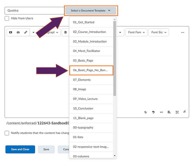
Figure 33: HTML editor with Select a Document Template drop-down menu for adding a theme / template
Tips and Tricks before you continue
Tip #1 - When copying and pasting text, try to use text which is not formatted

It is easiest to copy and paste text into a Brightspace template when that text is not formatted yet (font type, size, colour).
The easiest way to avoid formatted text is to work in Notepad which should already be installed on your UHI machine. You can type text in Notepad and then copy it into your Brightspace template.
Even if you work with formatted text from a word document, you can past this formatted text into Notepad and then copy the text again from there. That should have deleted any previous formatting.
And if you copy-paste formatted into the template, just make sure to adjust font type and size via the text editing features of the HTML editor (refer back to Getting started > Step 1 - Create a file for an overview) so your content has a uniform look to it.
Tip #2 - Use what you want and delete what you don't need

You don't have to use all the content in any given HTML template. Simply keep what you need and delete the rest.
Tip #3 - Accessing the HTML code (for advanced users and advanced templates)

If you use one of the templates for advanced users, you will need to edit the HTML code. To get to the HTML code, simply click on the </> symbol in the bottom right-hand side corner of the HTML editor. This will open the HTML code.

Templates for beginners
There are different sets of templates you can use in Brightspace.
You will find more information with a short description for each template below.
These templates have instructions in them on how to use them and are great for absolute beginners. In most cases, the instructions are formatted like the text you will ultimately paste in, so can easily be replaced by your actual text.

01_Get_Started
- ... tells you about how to get started with HTML templates though you won't have to worry about most of the information in the template as all templates are a fixed component in all your Brightspace module / units / courses.
02_Course_Introduction
- ... great for a brief introduction to the module / unit / course. You can replace the image in the template and add your own text below.
03_Module_Introduction
- ... for more detailed module / unit / course information. You can replace the banner and add a more detailed description for your module / unit / course. You can also include learning objectives in a numbered list.
This is also a handy template to have at the beginning of a topic or week. You can add a short description of the learning for the topic and week and add the learning objectives for the topic or week.
For tips on how to write learning outcomes, check out this guide.
04_Meet_Facilitator
- ... great for adding information about lecturer(s) and / or instructor(s). You can replace the banner and edit the facilitator information and image.
Remember that you can add the teaching staff information in the teaching staff widget on your module / unit / course homepage. You could then use this template to introduce additional teaching staff or guest speakers.
05_Basic_Page
- ... probably one of the easiest page to use. It is great for adding a banner at the top as well as some basic text with headings.
06_Basic_Page_No_Banner
- ... probably the easiest page to use. It is great for adding some basic text with headings.
07_Elements
- ... great for getting some ideas for different types of lists and tables.
08_Image
- ... great template to use if you want to add some images. You will find information on how to align images and examples on how to insert floating images.
09_Video_Lecture
- ... great template to use if you want to embed a video for your students. This can be a lecture or any other instructional video you can use in a copyright compliant way.
For more information, check out the MEDIAL guidance.
10_Conclusion
- ... great basic template to use at the end of a topic to provide students with information about next steps. You can replace the banner and any of the text in the template.
11_Blank_Page
- ... great for adding your own text with a banner. You can replace the banner and insert any of your own text below.
These templates all have an ice cream theme to give you an idea of what content would look like. There are also some instructions and explanations. These templates are a bit more advanced than the ones in Set 1 above.
Just as with the templates in the first set, you can replace any of the text, images, etc. with your own.

00-typography
- ... tells you about different types of headings and fonts / font sizes as well as quotes. You will also find information about links and image captions.
01-lists
- ... great if you want to try out some more advanced lists (numbered and unnumbered).
02-responsive-text-images
- ... similar to the image template in the previous set but with more information on responsive images which work with different sizes of screens.
03-columns
- ... great if you want to try out some more advanced formatting, i.e. displaying your content in columns. Columns allow you to organise your page in a different way from just top-down text allowing for visual breaks. They can also help you to present comparative information.
04-timeline
- ... great if you want to visualise stages of a development or progression. This template is also handy if you want to display steps in a step-by-step instruction.
05-callout
- ... great template for helping you highlight information in boxes.
06-panels
- ... as a visual tool to help you present content side by side to compare and contrast.
06-videos (further down the list)
- ... similar to the video template in Set 1. This template allows you to embed a video in your content.
For more information, check out the MEDIAL guidance.
Templates for advanced users
These templates all have an ice cream theme to give you an idea of what content would look like. There are also some instructions and explanations. These templates are advanced than the ones on the previous page and will require you to edit them in the HTML code.

00-buttons
- ... allows you to have buttons that students can click on to reveal information. This can help you to highlight additional or supporting content.
01-click&reveal-table
- ... similar to the template above. This template allows you to have buttons students have to click on before new information is revealed. This can help to give students time to think about a question before revealing a potential answer or further information.
02-dynamic-questions
- ... similar to the click and reveal above, this template is particularly great for giving your students a question to think about or reflect before giving them the answer. Students can take the time to consider the question or a statement and click on the button to reveal the answer or further information when they are ready.
03-accordions
- ... allows you to organise bigger amounts of contents. This template comes in handy when you have related points with additional information.
04-tabs
- ... help you structure content like it might appear on a website. This template can help you show progression of information or for grouping content.
05-flipcards
- ... another way of either grouping content or for providing students with a question or statement to think about before the information or further content is revealed.
How to present your pages in the Brightspace content area
By default, your pages created in Brightspace, just like any other content you upload, only appears as a link in the content area (Figure 34).
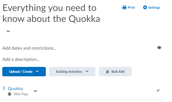 Figure 34: Content item / topic in a content (sub) folder
However, you can add a description to this content items as well as to content folders, subfolders and other items / topics, such as documents and activity links.
To do so, you can select an individual content item to edit it by clicking on the drop-down menu next to the content topic and then selecting ‘Edit Properties In-place’ (Figure 35).
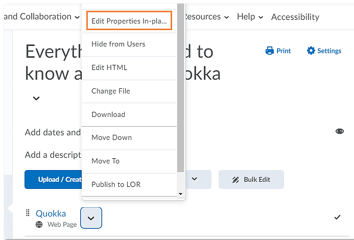 Figure 35: Drop-down menu of content item with option to Edit Properties-in-place
You can also bulk edit descriptions by selecting the ‘Bulk edit’ function below the (sub) folder description area (Figure 36).
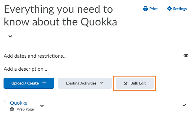 Figure 36: Bulk edit option for content items
You will now be able to add a description to individual or multiple content topics. Start by clicking on Adding a description (Figure 37).
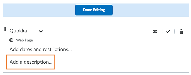 Figure 37: Add a description option below the content item / topic
The HTML editor will open. Enter your description and click on the blue Update button when you are done (Figure 38).
Since you are using the HTML editor here, you could also insert images, lists, etc. but make sure that your description is not too long so it doesn't interrupt the flow of content items / topics in the folder.
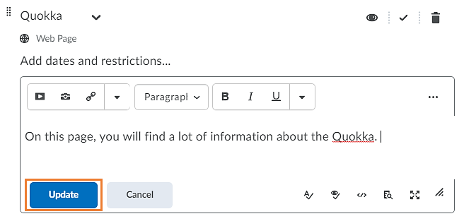 Figure 38: HTML editor to add content item / topic description
If you edited the description in Bulk edit mode, you will now also have to click on the blue Done button at the top of the screen (Figure 39).
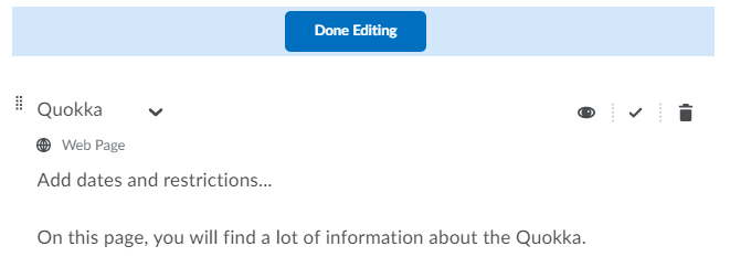 Figure 39: Done Editing button at the top of the content (sub) folder
You will now see that the description you added is displaying below the name of your content item / topic (Figure 40).
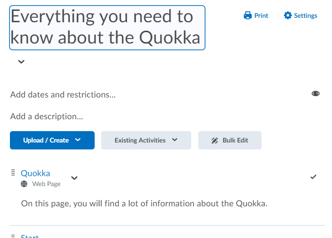
Figure 40: Newly added description below content item / topic
Similarly, you can add a description to a content (sub) folder. Simply click on the ‘Add a description…’ text below the (sub) folder title (Figure 41).
Now follow the same steps as outlined above for the content item / folder.
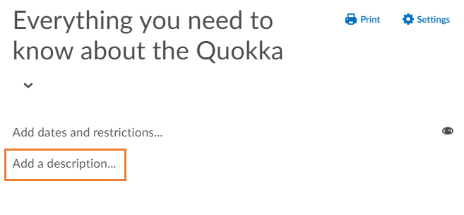 Figure 41: Add a description option below a content (sub) folder title
 Pixabay